Thursday, April 25, 2024

NYRB How American Eyes Got Modern-ized


How American Eyes Got Modern

Susan Tallman

Reviewed:

Trailblazing Women Printmakers: Virginia Lee Burton Demetrios and the Folly Cove Designers

Princeton Architectural Press, 224 pp., $35.00

by Elena M. Sarni

A Model Workshop: Margaret Lowengrund and The Contemporaries

Catalog of the exhibition edited by Lauren Rosenblum and Christina Weyl Munich: Hirmer, 120 pp., $39.95 (distributed by University of Chicago Press)

an exhibition at the Print Center New York, September 21–December 23, 2023

Art for the Millions: American Culture and Politics in the 1930s

Catalog of the exhibition by Allison Rudnick, with contributions by Kirsten Pai Buick, Max Fraser, and Rachel Mustalish Metropolitan Museum of Art, 208 pp., $50.00 (distributed by Yale University Press)

an exhibition at the Metropolitan Museum of Art, New York City, September 7–December 10, 2023

The Women of Atelier 17: Modernist Printmaking in Midcentury New York

Yale University Press, 284 pp., $70.00

by Christina Weyl

In the standard telling, the story of midcentury American art is a saga of hyperbolically talented painters working large and abstractly to manifest an existential encounter between man (notwithstanding the occasional begrudged woman) and material. “What was to go on the canvas was not a picture but an event,” in Harold Rosenberg’s catchy 1952 formulation. Canvas-as-event became a publicity magnet, inspiring popular news items like Life magazine’s 1949 “Jackson Pollock: Is He the Greatest Living Painter in the United States?” along with decades of New Yorkercartoons. On the home front, however, in private houses and apartments, things were different. Rosenberg, in that same essay, noted that “advanced paintings today are not bought by the middle class…. Considering the degree to which it is publicized and feted, vanguard painting is hardly bought at all.”

The disconnect between the art that people choose to acquire in a given moment and the art that later generations find of value is a trope of art history: Van Gogh sold one known painting in his lifetime, Vermeer died bankrupt, and so on. From today’s perspective, though, what is so striking about Rosenberg’s comment is its allusion to middle-class collectors. From the Gilded Age to the Jazz Age, America’s rich had gotten richer, enabling folks like Henry Clay Frick, Isabella Stewart Gardner, and J.P. Morgan to build personal museums (though their aristocrat-manqué hearts belonged to old masters rather than vanguard painters). But then came the Great Depression, World War II, and progressive economic policies that redrew the contours of economic entitlement and with them the shape of the art market. A few months before Rosenberg’s essay appeared in ART news, a Time article on print publisher Reeves Lewenthal closed with the observation “The market for high-priced art is dwindling, he figures, and art’s greatest potential patron is the budget-conscious housewife.”

As subjects of art history, self-destructive geniuses are more seductive than budget-conscious housewives, but lately scholars rummaging about in the art attic have been pushing aside those big, genius-laden canvases to uncover a different, homier story of how American eyes got modern.

“Art for the Millions: American Culture and Politics in the 1930s,” at the Metropolitan Museum of Art last fall, was an engaging survey of stridently egalitarian images and objects produced in America during the Great Depression, from Ben Shahn posters and issues of New Masses to Ruth Reeves textiles and a lovable baby monitor by Isamu Noguchi. The show also charted artists’ embrace of collective action, not just for the working classes but for themselves. Artist agitation contributed to the creation of the WPA’s Federal Art Project (FAP), whose double aim was to provide employment for artists and deliver art to the masses. Its Graphic Art Division paid artists to make lithographs and screen prints—more than 11,000 editions and nearly a quarter-million individual prints over the course of eight years—which were distributed to schools, libraries, and other public institutions. For artists such as Elizabeth Olds, it seemed a first step toward a “drastic reconstitution of the economics of the art market.”

Labor, unsurprisingly, was a popular subject in those FAP prints. At the Met you could see Louis Lozowick’s rail workers spraying cosmic sparks through penumbral fog in Night Repairs (1939); Harry Gottlieb’s Rock Drillers (1939), jackhammering away in bright overalls and porkpie hats (no ear protectors); Harry Sternberg’s riveters in Builders (1935), one with an insouciant cigarette in his mouth, poised on the cantilevered beam of a skyscraper-to-be; the seamstresses in Riva Helfond’s Curtain Factory (circa 1936–1939), locked together with irons and sewing machines in claustrophobic concentration. There were unemployed workers in soup kitchens, striking workers on picket lines, and lots of raised fists, along with more oblique forms of social commentary. One wonders what a school or library would have made of Olds’s Burlesque, with its front row of balding men ogling a chorus line of near-naked girls arranged, the curator Allison Rudnick points out, with the axial precision of an assembly line.
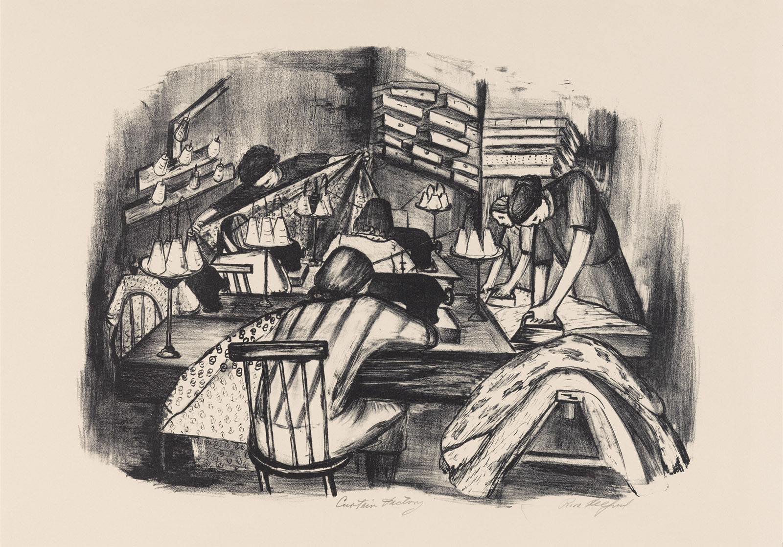
Curtain Factory; drawing by Riva Helfond

New York City Works Progress Administration

Riva Helfond: Curtain Factory, circa 1936–1939

Meanwhile, the private sector responded to the economic crisis with its own schemes for supporting art and artists. The normally patrician Museum of Modern Art mounted selling exhibitions such as “American Color Prints Under Ten Dollars” (roughly $220 in today’s money) that aimed to “stimulate the public’s interest in buying American art at moderate prices.” This was also the mission pursued, rather more doggedly, by Reeves Lewenthal’s Associated American Artists, whose nearly seventy-year existence was the subject of “Art for Every Home” (2016–2017), a catalog and traveling exhibition organized by Elizabeth G. Seaton for the Marianna Kistler Beach Museum of Art at Kansas State University.

Founded in 1934, AAA commissioned prints by living artists and sold them to middlebrow collectors through department stores and mail order. The prints were “original” (not mechanical reproductions), produced in limited editions, signed and numbered, and priced at five dollars to start with. Its first catalog was titled Bringing American Art to Americans, and national pride was part of the pitch. Farmland, farmers, and American life dominated the early offerings. Grant Wood did twenty-four editions for the organization, Thomas Hart Benton more than fifty. John Steuart Curry’s messianic John Brown lithograph (1939), on view in “Art for the Millions,” was an AAA print.

Their subjects were often socially progressive. There were sympathetic pictures of Black people, poor people, and at least one naked person. (Wood’s 1939 Sultry Night featured a full-frontal farmer and could not be sent through the post.) William Gropper and Rockwell Kent, the only two visual artists to be called before the House Un-American Activities Committee, were both AAAartists. Aesthetically, however, AAA art of the Thirties and Forties was conservative: the people looked like people and the landscapes looked like landscapes. There was no hint of the pictorial disruptions that had been remaking European art for a generation: no Cubism, no Surrealism, no abstraction.

These were presumably the kind of thing that Mark Rothko and Adolph Gottlieb had in mind when they boasted in a letter to The New York Times that their own work—conceived as “an adventure into an unknown world”—

must insult anyone who is spiritually attuned to interior decoration; pictures for the home; pictures for over the mantel; pictures of the American scene; social pictures;…the Corn Belt Academy; buckeyes; trite tripe; etc.

Thus we get the sense of a midcentury American avant-garde alienated from a progressive middle class and a middle class indifferent to the discoveries of the avant-garde. Was this really the case? Rosenberg was no doubt right that middle-class buyers were not lining up to buy Abstract Expressionist paintings. The average American home measured around a thousand square feet and would have been hard-pressed to accommodate big canvases, regardless of their style or cost.

But the ideal of art as “an adventure into an unknown world” was not the exclusive property of painters or of heroic scale. Printmaking, exploited in the Thirties as an instrument of populist utility, had other attributes: it was full of counterintuitive, hard-to-control processes that might be ideal embarkation points into the unknown. Jackson Pollock was making loop-de-loop engravings with the experimental printmaker Stanley William Hayter years before his drip paintings.

Hayter, a British geologist turned Parisian Surrealist, took the view that every stage in the making of a print, from prepping the materials to inking and printing, was an opportunity for artistic invention and discovery. At the time, most print editions relied on a division of labor: the artist composed the image, then handed the stone or plate off to a professional printer for execution. The goal was efficiency, not experimental mucking about.

Hayter inverted those priorities. For him it was about “what the plate is doing to you and not what you are doing to the plate only.” In exile in New York during World War II, he taught his methods to a range of print-curious artists. Christina Weyl’s The Women of Atelier 17 (2019) details the pros and cons of this tutelage. Inspirational but overbearing, open-minded but dogmatic, Hayter alienated many of the artists who passed through, but the notion of printmaking-as-adventure stuck. By 1956 the Brooklyn Museum curator Una Johnson was noting with pride that

one of the distinguishing features of prints in the United States is that the majority of them are printed by the artist himself and not by a professional craftsman-printer as is so often the case in France.

American prints of the Fifties don’t get a lot of wall time these days in museums and galleries, so “A Model Workshop: Margaret Lowengrund and The Contemporaries” at the Print Center New York last fall was a rare chance to see what Johnson was so excited about. The model workshop in question was a novel hybrid art space—part gallery, part printshop—that opened its doors on Madison Avenue in 1951. Its goal, explained Lowengrund, its founder, was nothing less than “a renaissance of graphic arts in this country.”

Lowengrund understood (as did the leaders of the better-known workshops that followed) that this meant cultivating both artists and buyers. Like Hayter, she was an artist in her own right. Unlike him, she advanced no particular method or aesthetic. The pocket survey of her own work in the show sashayed through various up-to-date idioms: an atmospheric aquatint of Washington Square Park from the Twenties had the picturesque precision of late Whistler or early Edward Steichen, while her lithographs for the FAP valorized workers with muscular grace, and a winter scene painted in Woodstock in the Forties wriggled with Charles Burchfield–esque trees. She called her new space the Contemporaries because even in 1951 “modern” was beginning to feel restrictive.

In the Contemporaries workshop, artists could learn and work with or without assistance, depending on their skills and druthers. Some arrived as technically savvy printmakers, others were painters and sculptors drawn by curiosity. The Print Center exhibition, curated by Weyl and Lauren Rosenblum, included a short 1955 documentary in which the artist Reginald Neal demonstrates the making of a color lithograph, giving an immediate sense of the alchemical attractions and mutability of the process (as well as the cavalier approach to splashing solvents in the vicinity of lit cigarettes). With her gallery, Lowengrund similarly sought to create a program that would be “inflexible as to quality” but “catholic enough to include the works of artists of all schools of expression.”

David Smith made his first lithographs at the Contemporaries in 1952, using the stone much as he did paper in his drawings, as a space for squiggled notations like alien runes. One that was on view at the Print Center, however, incorporates a second stone with pale blue smears that give the squiggles curious heft, less like writing and more like tools on a pegboard. Also in the show was a Lee Krasner lithograph, a fraction the size of her canvases but organized through the same taut line dancing along the edge of chaos. In an early Corita Kent screen print, a storm of gestural color all but conceals the figures of the Virgin and Gabriel—a non-serene Annunciation where alarm and elation are present in equal measure.

This was cutting-edge art on a domestic scale, and it was affordable. Lowengrund established a print-of-the-month program, with prices capped at fifty dollars (less than six hundred dollars today)—more than AAA’s prices in the Thirties, but the editions were smaller and the nation was now richer. It was a trial marriage between the new ideals of art and the old goal of bringing artists and middle-class audiences together. And it almost worked.

The title of Elena M. Sarni’s book Trailblazing Women Printmakers: Virginia Lee Burton Demetrios and the Folly Cove Designers is unfortunate. The subjects were not printmakers by any definition used in the art world, they were not exclusively women, and it’s hard to know what “trailblazing” means when applied to a collective producing hand-blocked fabrics (a technique thousands of years old) in the middle of the twentieth century. But pay no mind—it is worth learning about them because their creations were almost uniformly delightful and raise useful questions about where we set fuzzy edges between art and design, gallery and living room.

The organization owed its existence to Virginia Lee Burton, best remembered today as the author and illustrator of the children’s classics Mike Mulligan and His Steam Shovel (1939) and The Little House (1943). Soon after moving to the hamlet of Folly Cove, on Cape Ann, Massachusetts, with her young family in the Thirties, Burton began giving neighborhood classes in linocut printing on fabric. Linocut is inexpensive and easy to master, especially if, like the first Folly Cove members, you forgo a press and print your blocks by jumping on them (a ridiculous-looking exercise recorded in both photographs and fabric patterns). Linocut’s atavistic simplicity—one step up from potato prints—encouraged a lean clarity. By 1941 she had a formally established collective with a membership that included trained and amateur artists, trailing spouses, and local housewives.

Burton’s children’s books use modernist visuals—geometric blocks and gradients, dynamic space, compressed action—in the service of cozy sentimentality. The love interest in Mike Mulligan is an obsolete machine in danger of being scrapped; the protagonist of The Little House is a superannuated building encroached upon by urban life. Both get happy endings, where past and present coexist amiably. The fabric designs and table linens that came out of Folly Cove had a similar character: witty and charismatic, with a distinctive blend of aesthetic refinement and aw-shucks folksiness.

All motifs were drawn from life, a rule that fostered rural and regional subjects: seagulls, cranberry bogs, Queen Anne’s lace, lots of mice and chickens. But while these people lived in the country, it was still the twentieth century: women wear trousers, people drive cars. One pattern by Lee Natti shows black-and-white chickadees perched on pine branches that might have been sculpted by Harry Bertoia, while Aino Clarke’s streamlined people toweling off in a sauna would not have been out of place in the Art Deco splendor of Rockefeller Center. (Finnish names and habits were a legacy of immigrants recruited to work the local granite quarries.) Burton, the storyteller, condensed whole narratives into pattern with ingenious visual economy: one follows a prizefight from boastful flexing to a double knockout while the crowd leans left, then right, then erupts in cheers. In another, we watch a woman doing calisthenics get slimmer frame by frame, with each stage partitioned by an ornamental measuring tape.

Sold through craft outlets like America House in New York, by mail order, and from a barn on the property Burton owned with her husband, George Demetrios, Folly Cove’s products found a ready audience. Far from being an outlier, their blend of rusticity and sophistication reflected the sensibilities of an art world that warmed to both modern painting and historical American crafts. One of the gems in “Art for the Millions” was Charles Sheeler’s 1931 painting Americana, which took lessons learned in Paris when Cubism was on the boil and applied them to a ladder-back chair, a trestle table, and a Shaker box. In 1932 MoMA, definitionally the museum of modernism, mounted a major exhibition of eighteenth- and nineteenth-century American folk art. (Its curator, Holger Cahill, would go on to head the FAP.) Photographs show the apartment of the Whitney Museum’s first director, Juliana Force, stocked with Cubist still lifes, folk art portraits, and dangling eagles upcycled from old weather vanes.

In 1945 the design-forward head of Lord and Taylor, Dorothy Shaver, solicited Folly Cove designs for a run of commercially printed fabrics. The store’s street-level windows were dedicated to a celebration of the group. An article appeared in The New York Times (“Designs with an American Accent”) and another story ran in Life. Other partnerships followed: F. Schumacher and Co. commissioned fabrics and wallpapers; the Edwin M. Knowles China Company wanted dishware designs; Rich’s department store in Atlanta requested Georgia-themed patterns and shipped local plant life to Massachusetts for study.

Everyone was aware of the postwar boom in new homes, which needed new objects to fill them. AAA expanded its print business to include artist-designed glassware, ceramics, wallpaper, and fabric, including a repeating pattern adaptation of Grant Wood’s twenty-year-old painting The Midnight Ride of Paul Revere. Around the time William Gropper was called before HUAC, his winsome design “Spring Rain” came out as fabric.

The Contemporaries too saw opportunity: in the catalog for “A Model Workshop,” the design historian Sarah Archer chronicles Lowengrund’s pursuit of advertising directors, decorators, and architects as vectors for art distribution; she even mooted a service whereby artworks might be commissioned or adapted for specific settings, in different sizes and, “provided the artist is amenable,” different colors. In 1953, art from the Contemporaries was used to lend cultural élan to model apartments in a new high-rise in Riverdale, in the Bronx. The promotional publicity, Archer notes, credited the gallery “as a ‘source,’ akin to the creator of hand-blocked wallpaper or upholstery fabric, but the individual artists who made the prints in question are not identified.”

Most art is bought as decoration—destined not for museum walls or climate-controlled free-port storage but for hallways, offices, and that maligned space over the mantel. But to describe a piece of modern art as decorative is generally taken to belittle it, to cast suspicions of complacency, of aesthetic or even moral laziness. Rothko, Gottlieb, and most artists at the Contemporaries would have agreed about this: good art is not there to charm or placate; it is there to unsettle. The point of the event-on-canvas (or litho stone, or etching plate) was not, they believed, the solution it represented but its enactment of the insoluble problem of human existence.

The catch, as Mary McCarthy pointed out in a 1959 issue of Partisan Review, was this: once an object leaves the studio, its unsettledness begins to settle. Eventually that gestural event becomes “just as much an art-object as the piece of driftwood on the coffee table or the seashell on the Victorian whatnot…. The truth is, you cannot hang an event on the wall, only a picture.” And a mere picture was just a hop, skip, and a jump from becoming a “profit-commodity” ready for exploitation by “fashion designers, educators, and wallpaper firms.”

You could watch this process unfold in “A Model Workshop.” For all the fine works of art on view, and for all the individual struggles of creation they invoked, the show had a visible repetitive cadence—this was part of why it looked so great on the wall. Step back and you saw the same shapes pop up over and over. They were there in Seong Moy’s Kuang Kung (1952) woodcut of a standing figure, in Gabor Peterdi’s landscape etching The Swamp #2 (1954), in Edward Millman’s skittish Laughing Bug (1952), in the abstract lithograph Reginald Neal makes in his film. You know these shapes: the spiky tangles like snippets of barbed wire, the razor-edged polygons, that off-kilter pointy-ended sling—the Nike swoosh of midcentury angst. It is the look of the Fifties. Everything—animal, vegetable, or mineral—looks like it could put your eye out, but soften that swoosh a bit and you’ve got boomerang Formica.

Folly Cove designs are not diminished by this event-to-picture-to-decoration progression, since they never pretended to be other than decoration. The closest thing to images of struggle reproduced in the book is a trio of tight linocuts showing work in the quarry. Made by one of the group’s few male participants, Eino Natti, and printed on paper, they would not have been out of place in “Art for the Millions.” But in an unfinished how-to book about the Folly Cove method, Burton speaks to her imagined reader, someone who “wants to decorate her home…and express herself in her curtains or dresses or table linen.” This was not the expression of Elizabeth Olds or Lee Krasner. It was expression as an antidote to, rather than an investigation of, the difficulties of life. Folly Cove designs are so winning because they have a twentieth-century aesthetic without any twentieth-century anxiety. Even the pinwheel-mandala design titled “Atomic Age” is cheery.

The question McCarthy left unasked was: What’s wrong with wallpaper? When Keats wrote “Beauty is truth, truth beauty,” he was, after all, talking about a vase, and reformers from William Morris onward pushed the ideal of the home as a work of art, capable of expressing ethics as well as beauty, a kind of feng shui political tract you could sleep in. Early-twentieth-century avant-gardists had made a point of appropriating mass-market decorative arts: Picasso, Braque, and Gris stuck printed oilcloth and wallpaper on their paintings and collages; Man Ray had fun with flat irons. Duchamp’s readymades made clear the power of the viewing eye and mind in reconstituting found objects as art. (McCarthy’s driftwood on the coffee table might be seen as the readymades’ Zen offspring.)

In 1948, when Life convened a roundtable discussion on modern art (“fifteen distinguished critics and connoisseurs undertake to clarify the strange art of today”), Aldous Huxley (with possible snark) compared Pollock’s drip painting Cathedral (1947) to wallpaper, arguing that it could repeat indefinitely around the room, while Sir Leigh Ashton, the director of the UK’s foremost design museum, observed that the same painting “would make a most enchanting printed silk.” He wasn’t wrong. But everyone knows you pay a different kind of attention to a painting.

The “drastic reconstitution of the economics of the art market” that Elizabeth Olds looked forward to in the Thirties never came to pass. The FAP closed down in 1943, and art production reverted to private enterprise. Lowengrund probably did change the course of contemporary art, laying the groundwork for the American “print boom” that arrived with Pop Art, but in the Fifties her profit margins were too low and Manhattan rents too high to be sustainable; shortly before her death in 1957, the Contemporaries was adopted by Pratt Institute and reemerged as Pratt Graphics Center. And while that 1950s moment of William Gropper wallpaper may have been the stuff of Partisan Review nightmares, it proved unremunerative. The budget-conscious housewife turned out not to be art’s greatest patron after all.

The Folly Cove Designers, meanwhile, found they preferred the pace and self-determination that came from producing their own small-batch goods. They wound down their commercial involvements before finally disbanding in 1969, soon after Burton’s death. Anyway, in the Sixties the whole cycle McCarthy described had gone from being art’s predicament to being its acknowledged subject. AAA adapted. Selling David Hockney prints in the Sixties and Christo prints in the Seventies, it trundled on until 2000—undone in the end by Reaganomics and the return of a plutocratic art market.

Seventy years after Rosenberg it is still the case that “advanced paintings” are not bought by the middle class, but it is no longer true that they are “hardly bought at all.” Instead, vanguard art is the Bitcoin of palpable objects—a place to park stupidly large amounts of money while keeping speculative fingers crossed. And the middle classes? Well, now there’s Etsy for etchings and linocuts in the high two figures, and the museum gift shop, where you can buy modestly priced authorized reproductions of Rothko paintings, scaled down to fit nicely over the mantel.

Monday, April 22, 2024

NYRB Nicole Eisenman Art The Must-Also-Haves


The Must-Also-Haves

Julian Bell

Reviewed:

Nicole Eisenman: What Happened

Catalog of the exhibition edited by Monika Bayer-Wermuth and Mark Godfrey London: Whitechapel Gallery/Munich: Museum Brandhorst, 269 pp., $55.00 (distributed in the US by Artbook/DAP)

an exhibition at the Museum Brandhorst, Munich, March 24–September 10, 2023; the Whitechapel Gallery, London, October 11, 2023–January 14, 2024; and the Museum of Contemporary Art Chicago, April 6–September 22, 2024

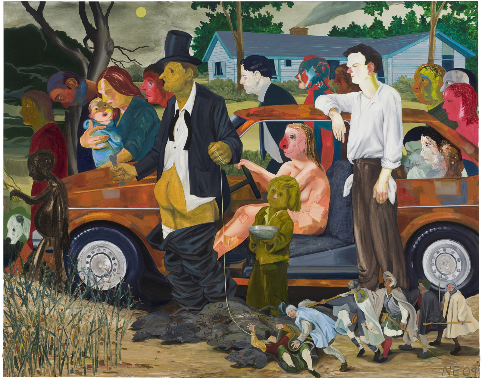
Mugshots of late capitalism, I caught my tongue murmuring: in these galleries you face an era’s ID. I was wandering through “What Happened,” an exhibition in London of paintings, drawings, prints, and sculptures created over the past three decades by Nicole Eisenman. What prompted my resort to that loose period label? Since her graduation from the Rhode Island School of Design in 1987, the imagined publics toward which Eisenman has directed her copious, convivial energies have grown in scale. Her notional constituency, cartooning and muraling in 1990s Manhattan, was fiercely local, an East Village queer scene. The canvases and sculptures of the middle-aged artist, however, have at times amounted to satirical State of the Union addresses. The Triumph of Poverty (2009; see illustration on page 8) led the way, painted after the subprime mortgage scandal and the financial crisis it catalyzed: a composition nearly seven feet wide presenting a motley march of the repossessed—some pitiable, others grotesque—stalled on the edge of town in front of a clapboard bungalow on the point of being arsoned. Presiding, but most clueless of all, is a banker whose pants have collapsed to reveal that he stands literally ass-backward. More recently and yet larger, there has been Dark Light (2017), featuring fossil fuel diehards before pipes that gush carbon-dense blackness, and, the year after the 2016 presidential election, a ship of fools about to hit the rapids entitled Heading Down River on the USS J-Bone of an Ass. 

Witnessing the profit system trip over its own feet, we might reach for a conceptual scapegoat: in this sense, another symptom of “late” (or “late-stage”) capitalism would be that the owners of Eisenman’s satire of repossession derive their wealth from a major lending company. The originally Marxian category has also—ever since its citation in the title of a 1991 book by Fredric Jameson—been extended from public to aesthetic affairs, on the premise that art obeys a recursive pattern similar to other forms of production when it settles for mash-up tactics, with image makers promiscuously referencing their historical forebears. The insertion in Eisenman’s Triumph of a row of figures transcribed from Bruegel would be one small instance of this, in a body of exhibited work that suavely nods to Ingres, Picasso, Philip Guston, Marvel Comics, Renaissance triptychs, German Expressionism, and much else. Eisenman’s high-spirited studio practice equivocates on questions implicit in much of the recent figuration spurred by her example. Given that there is a vigorous market in the 2020s for culturally freighted wall hangings, should painters look to art history for legitimation by name-dropping, for angles of critical attack, or simply for reassurance that their skills have a structural place in society?

But in truth, it was hardly these debating points that guided me as I chanced on my periodizing phrase. More, I was tempted by the word late. For the hour generally is late in Eisenman’s pictorial world, the palette prevailingly fuscous. We find ourselves—in several memorable canvases produced in her early forties—in some packed 1:00 AM beer garden, amid the ripped, the randy, and the maudlin. We meet a similar Manhattan gang, now soberer in purpose, maintaining an all-night protest to demand police defunding in The Abolitionists in the Park (2020–2021), the most grandiose but perhaps the lowest lit of her big public paintings. Others among them also yank the tone down: the fierce surge of black paint in Dark Light, a starlit sky that is the ship-of-fools painting’s most inventive passage, Triumph’s patchwork of yellow-greens and orange-puces that is as heavy, queasy, and warm as the contents of a compost bin. Alternately, when—in a suite of big canvases from the mid-2010s—Eisenman pictures average Americans in their privacy zones, she visualizes bleary, screen-zonked saddos. She wants caringly to enter their lonely rooms, but her curiosity is fretful. Late tips into too late, implying impending crisis. Time to shut it, boy. Time running out for orders to the bar, time running out for the US to change course. The temper the exhibition communicates is at once effusive and foreboding.

The less tomorrow becomes thinkable, the more license to splurge today: a system’s impending demise may reveal itself in feverish hilarity. The daring of many of these pieces is the daring of buying up every pigment, medium, and brush in the paint store and getting them to chime polyphonically. If chromatic extravaganzas such as The Abolitionists or Beer Garden with A.K. (2009) stay readable, that is thanks to Eisenman’s consummate assurance as a figure drawer. She sprang out of RISD fully prepared, it seems, to rotate human bodies in every conceivable contortion and combination. In those early days her imagining was near monochrome: brown lines and orange washes predominated, lending a frowsty, preloved look both to her cartooning and to the ephemeral murals she volunteered to daub on the walls of arts venues. (The exhibition features a video résumé of these, suggesting that underneath all the swanky turns at pastiche, her imaginative seedbed was 1930s public art commissioned via the WPA.) The dreams were of galumphing masses in motion: naked Amazonian females presided, here wreaking vengeance on males, there giving each other head or perhaps a helping hand.

Spiky cartoons and murals—for the 1995 Whitney Biennial, a visualization of that museum collapsed in ruins—allowed Eisenman to flaunt her picture-making skills in a milieu where their status was uncertain. In the metropolitan scene she entered after graduation, the view remained widespread that for art to face forward, it must somehow move on from the format of the easel painting. Feeding the skepticism was the sense that a tradition of salable wall hangings bearing a trenchantly masculine stamp served a capitalism so “late,” so grotesquely athwart our present needs, that it was overdue to expire. Could guerrilla warfare against that patriarchy help dispatch it? Queer imagery, in that case—work that mocked and upended gender stereotypes—was art’s ally, supposing art involved liberating multiple forms of human potential. “Angry and sad about how completely fucked up male privilege is,” Eisenman ran with this ethos, at once swaggeringly able and apt to switch the mocking mirror in her own direction, in the process acquiring some celebrity. To this day she keeps that faith, participating in a queer exhibiting collective indicatively named Ridykeulous.

But to walk through “What Happened” is to watch the 1990s recede like the memory of a wild evening. This is a show dominated by large easel paintings: those with the beer gardens were painted by a settled householder in the late 2000s, piecing together scenes from her boho youth. Back then she had also filled canvases, but in a Mannerist spirit—that is to say, with arch, fantastically contorted figure compositions that half taunted the viewer, What business have you to interpret me?

By Eisenman’s forties, her demeanor had altered. An inclusive entertainer had emerged. Witness Seder, a relatively modest—four-foot-wide—canvas from 2010 (see illustration on page 6). Here is the painter’s Jewish family gathered at their Passover table as if for a fond sitcom—eight oddballs, each summoned up in a separate language of texture and color, Eisenman’s brush staging further variety turns for the matzo the viewer’s own hands can be seen holding and for the early-Rothko-like swirls on the dining room’s far wall. This wry group portrait exemplifies what’s technically strong about Eisenman’s practice. She’s not an artist to look to for especially subtle or surprising mark making, in contrast to that slightly older voice in New York painting, Amy Sillman. But where she does—literally—draw the line, it holds firm. Her edges interlock with such panache. In Seder’s collage of personal memories we see the youngest child at table gleefully plunge her knife into a beet-topped gefilte fish that’s refracted through a wineglass: what a joy of invention, both comical and formal, has gone into that collision of incidents.

This communicative Eisenman has offered inspiration to younger artists, partly because her work readily lends itself to narrative readings—as she has explained, she is a psychiatrist’s daughter “from a line of people who dealt with stories”—but more generally through the sheer inquisitive buoyancy with which she has deployed paint to take on the world. Further eye-stopping details such as a cat in Weeks on the Train (2015) dimly glimpsed through a pet carrier’s mesh, or the fanatically rendered plastic of a TV’s rear cover in Reality Show(2022), advertise the incomparable versatility of oils—in the latter case, as an implicit riposte to the screen, the backlit pixels of which are now our pictorial norm. The taste for meticulous manufacture that is evident here has spread through the current vogue for figurative painting: it’s where Eisenman’s example has overlapped with that of Kerry James Marshall.

As art scene priorities have moved on from the 1990s, discourse about “queerness” has scrambled to keep in step, or so it appears from critics’ writings cited by Mark Godfrey, one of the exhibition’s curators, in his handsome catalog essay. Anything in Eisenman’s art, from its “sensuous tactility” to its “treatment of mundane details outside the painting’s focal point,” is claimed to be queer, while “the oscillation between texture and atmospheric mood” is said to generate “productive, queer friction.” The term resembles a once-turbulent weather front that has drifted out to sea and is, as the forecasters say, “losing definition.”

“I might use that word to describe myself but not my work,” Eisenman told an interlocutor who had sought her views on an “emerging queer aesthetic” in a 2019 discussion. Tactility, it’s true, is a value she currently reaches for to rationalize the case for her art. By foregrounding surface textures and that ready vessel for empathy, the figure, she hopes it will establish “a deep connection with the viewer.” But this is not to promote an identity constituency: rather, it’s to bypass demarcations. The only category in her sights nowadays would seem to be the human species.

A kind of sculptural manifesto for this forms a centerpiece to the show. Maker’s Muck (2022) invites us to walk around an outsize seated figure, a crude plaster model bearing no face and only minimal signs of female identity. On sprung-hinged wrists, her hands close in on a large dollop of moist clay that a motor rotates and a feed pipe keeps watered. On every side of this allegory of the eternally form-creating human being, excrescences are scattered—sundry small figures and constructions in every medium from plywood to bronze, polystyrene to terra-cotta. The ensemble is at once imposing and banteringly absurd, showing creativity and detritus as two sides of one coin. But to this viewer, at least, the folly is the wrong side of foolish. Despite its would-be facelessness, the main figure inevitably points back to Eisenman—as if to a twenty-first-century Picasso astonished at her own inventive fertility—revealing a tail-chasing self-regard to which she is too susceptible.

The Triumph of Poverty; painting by Nicole Eisenman

Leo Koenig Inc., New York City

Nicole Eisenman: The Triumph of Poverty, 2009

It repeatedly leads to poor judgments of scale, as in japes about her own career (e.g., the painting From Success to Obscurity, 2004), better suited to Instagram than to foyer-filling expanses of canvas. Nonetheless, canvas, on the evidence of this show, remains a happier arena for her than three dimensions, for all her growing interest in sculpture over recent years. The omnivorous grabbiness—every item in the art store and in the US public realm—remains a kind of marvel, as long as the trophies are compressed down flat. In actual space, the must-also-haves—that wheel-turning motor, that water pipe, or, say, the cuckoo clock imported into a 2018 plinth-mounted bust named Eagle—become laborious lumber, the heavier for the echoes such material bears of many a preceding sculptural practice.

Yet Eisenman’s will to investigate and to generate presents an example that overall is inspiring. Her force of mind, both aesthetic and political, is magnetic, although all I know of history tells me that even now, a young artist will somewhere be plotting a pushback against her warmhearted humanism, deeming it inadequate to our present late hour. I am left asking myself what—edification aside—I took away from “What Happened.” Not meanings, I find. I think of the canvas Hunting (2000), a fable of the frozen north featuring snow-suited, spear-wielding Amazons bearing down on the wreck of a helicopter and its stranded male crew. The bizarrerie of the scenario feels swaggeringly cryptic, but that in no way diminishes my relish for Eisenman’s orchestration of linear rhythms and a fastidious color scheme.

From that four-and-a-half-foot-wide Arctic fantasia I am led back to another, a more-than-ten-foot-high painting that Eisenman produced in 2019 in response to a sculpture of her own devising. Both this 2D and that 3D piece belong, along with many monotypes, to a suite of experiments with the form of the human head, on which she began working in 2012 and which has constituted her formally boldest art to date. In the case of the towering canvas, she recklessly chopped and reshuffled ice-white building blocks of flesh to yield a ghostly grim visage that juts out against shiver-inducing blues, lemons, and purples. Eisenman’s free play when working on the head suite spawned monsters: having fashioned them, she asked a writer friend to develop identities for each piece, shuttling them on a reverse journey from invention to intention. In the case of the great cranial iceberg, the title adopted became Econ Prof—essence, we are to imagine, of Milton Friedman, Alan Greenspan, Paul Volcker. Their mugshots distilled to one image: moving my eyes its way, I recall what first moved my tongue.

Sunday, April 21, 2024

John Singer Sargent NYRB Catching the Mo


Catching the Moment

James Fenton

Reviewed:

Fashioned by Sargent

Catalog of the exhibition by Erica E. Hirshler, with Caroline Corbeau-Parsons, James Finch, and Pamela A. Parmal MFA Publications, 247 pp., $65.00

an exhibition at the Museum of Fine Arts, Boston, October 8, 2023–January 15, 2024, and Tate Britain, London, February 22–July 7, 2024

The Music Lovers 

This is the painter John Singer Sargent, writing in 1880 to his friend Vernon Lee after a trip to Spain and North Africa:

You wished some Spanish songs. I could not find any good ones. The best are what one hears in Andalucia, the half African Malagueñas & Soleàs, dismal, restless chants that it is impossible to note. They are something between a Hungarian Czardas and the chant of the Italian peasant in the fields, and are generally composed of five strophes and end stormily on the dominant the theme quite lost in strange fiorituras and guttural roulades. The gitano voices are marvellously supple.

If you have heard something of the kind you will not consider this mere jargon.

What strikes one is the assumption of shared expertise. Had Sargent heard these dismal, restless chants? He seems to have. Had he tried but failed to notate them? A prodigious task for an amateur. Had he counted the strophes and noted the stormy endings on the dominant? It is hard to see, in any of his biographies, where he would have received the kind of musical education that might have enabled him to dash down a useful transcription of a fioritura, let alone a guttural roulade.

This is one of the mysteries of Sargent and Vernon Lee (the British writer who is always referred to by her full nom de plume rather than her given name, Violet Paget). Born, both of them, in 1856, into the expatriate world of the great Italian cities and the shabbier culture of the minor European spas, they had somehow devised their own educations on the hoof. They were both multilingual, but Vernon Lee did not have the remotest connection with university or college life. Sargent was clearly destined to be an artist, and in due course he took the conventional first steps, enrolling in a reputable Paris atelier and exhibiting at the Salon.

But he was also, to a mysterious degree, a musician. One thinks at first: Oh, but everyone in that world, in those days, was a musician in some sense. Then we learn that Sargent’s talents gravitated toward the fiendishly difficult end of the repertoire: he could play Isaac Albéniz’s piano suite Iberia (1905–1909). That alone puts him in the elite. According to the violinist Joseph Joachim, he could have been a professional musician. Sometimes it was said of Sargent that he did not necessarily play all the notes but had a gift for seizing on what was essential. That in itself would have been a sign of profound musicality. It offered a way of responding to the occasion. Supposing, for instance, a group of friends were sight-reading a four-hand piano transcription of Wagner’s Ring (the kind of thing Sargent’s circle liked to do), they might be grateful to have him as first piano, giving impetus to the rest.

Vernon Lee did not have the same musical gifts as Sargent. When reading a score she needed to pick out a melody laboriously on some instrument. She did take singing lessons, for which she lacked the necessary application, and she made a heroic stab at learning counterpoint. But she had an intense fantasy that she would somehow hear the forgotten music of the eighteenth century—the music that she reasonably believed to have been Italy’s greatest contribution to the art of the day. It was not then being performed. It was gathering dust in libraries. So she found teachers in Rome and Florence to help her with singing and counterpoint. She enlisted the services of librarians and other old men who had heard the great singing voices of bygone eras, and she must have listened avidly to their stories, for they made her welcome, arranged for her to have their scores copied, and helped her in her pursuit of, for instance, the arias that, sung always by the castrato Farinelli in the same order, had calmed the madness of King Philip V of Spain. In due course she began to see such stories as legends. But at first the arrival at her home of these laboriously copied scores produced in Vernon Lee an anxiety so intense that she could not bear to hear the music directly, as her mother played it for her benefit. She had to listen from the next room or through an open window.

She was, when she embarked on this lone musicological quest, thirteen. For most of it she was barely old enough to be allowed out of the house without a maid, and the ten days of study in the library of the august Philharmonic Academy in Bologna, which she undertook in the company of Sargent, must have been made possible by the presence of this responsible family friend and male chaperone. He brought his watercolors and copied the portraits in the library, which included distinguished alumni of the academy—Gluck, Haydn, and Mozart—along with a host of forgotten figures.

Sargent was right to expect Lee to have an informed sensitivity to musical idiom and genre, though we must not expect from her, or from him, the kind of response that comes from a long daily acquaintance with recordings of early music. Quite the opposite. They lived at the dawn of the early music revival, before it was yet known as such, but were receptive to what it might offer. Their reactions may sometimes puzzle us. Vernon Lee’s description of a Palestrina mass, for instance:

Some time ago I heard, for the first time since my childhood, Palestrina’s great Mass of Pope Marcellus; and I was much struck at finding that my impressions of this music differed only in their definiteness and more thorough understanding from the impressions which years ago I used to experience when listening, a thin and long-legged little savage of twelve, amidst the crowd in the Pope’s Chapel. The music was all about nothing at all. I can remember my childish wonder at the way in which the music went on. At that incessant movement which never leads anywhere, that incessant crossing of lines which are not woven together…

She is describing a child’s early experience of Renaissance polyphony. Who else has left us such a description? What other child? Vernon Lee had heard the celebrated Pope Marcellus Mass at least twice in her youth, and in the Sistine Chapel, too—the mass that is supposedly Palestrina’s response to the musical requirements imposed by the Council of Trent. (Hans Pfitzner wrote an entire opera about it, Palestrina.) In this context, “The music was all about nothing at all” comes as a surprise. And she seems to mean it as a compliment.

If we look for a piano teacher of genius who forced Sargent to acquire the foundational skills that would enable him, in due course, to play the works of his friend Gabriel Fauré in a way Fauré might respect, then it seems to me (after looking) that we will not find one. Sargent in the last resort can only have been his own teacher. But if we ask who might have encouraged Sargent and Vernon Lee to pay attention to the songs the peasants were still singing in the fields, and to try at least to make some record of this folk art, then a few names crop up, among them that of Alma Strettell, for whose collection of Spanish and Italian songs Sargent provided illustrations (and whose portrait he painted). She must have been a fearless collector of the songs of the Sicilian underworld—she mentions “songs of challenge, suspicion, affront, and ridicule,” and the vicariola, named after the Vicaria, the great prison in Palermo.

If her translations of these songs are forgotten today, it would be because they use an antiquated vocabulary and grammar. They come from surely the most astonishing person in the folk music revival of the period, Carmen Sylva, aka Elisabeth of Wied, queen of Romania. Here she is, introducing Romanian folk songs for a collection she and Strettell translated in 1891:

The young poetess [Elena Văcărescu] to whom we owe the discovery of these songs spent four years collecting them among the peasants on her father’s estates; and even though her family had for centuries been known and honored by this race, yet she encountered many difficulties in trying to induce the peasants to repeat their songs for her. She was forced to affect a desire to learn spinning, that she might join the girls at their spinning-parties, and so overhear their songs more easily; she hid in the tall maize to hear the reapers crooning them; she caught them from the lips of peasant-women, of luteplayers…of gipsies and fortune-tellers; she listened to them by death-beds, by cradles, at the dance and in the tavern, with inexhaustible patience. They are worthy to rank with the best national songs that India, Arabia, and the far North have given us.

This is not only an intensely romantic picture of a feudal song-collector—the aristocrat hiding in the tall maize, cocking an ear to her father’s crooning reapers. It also confirms the impressive range of musical reference that Sargent takes for granted when addressing Vernon Lee: Hungary, Africa, Arabia, and “the Far North” (meaning Finland, perhaps)—they all seem to have known no barriers to their enthusiasms and their research. They loved the small country with its evanescent heritage of song as much as two of them, at least, loved the music of Wagner—Wagner who in TheMastersingers of Nuremberg (as they would have called it) taught the audience (or appeared to teach them) how to compose a prize-winning melody in the grand medieval manner.

Strettell and Sargent were Wagnerites—of course they were Wagnerites. On warm summer evenings in the Cotswold village of Broadway, by that grand escarpment where Fish Hill leads abruptly down to the Vale of Evesham, after a day spent at the easel or basking in bright meadows, decked out in the beautiful fabrics Sargent had collected on his travels, they would gather at the piano and undertake to relate how Wotan, on the breaking of his spear, had called all his heroes to cut down the withered world-ash and stack its faggots in a mighty pyre around Valhalla. Sargent would take first piano, Strettell (no doubt fresh from either the Romanian cornstalks or some perilous Palermitan adventure) the second. Strettell and Sargent called themselves “co-maniacs” in their love of Wagner. Here is one Miss Heyneman, in London, recalling Sargent at an evening of home music-making in a Bayswater music room:

It was a very hot night in July and Madame Blanche Marchesi and Denis O’Sullivan [both celebrated singers] worked through the whole of Tristan, taking all the parts—tenor—bass—baritone—contralto or soprano in turn, even singing the chorus parts together. The windows were wide open and a great crowd collected outside, for both Madame Marchesi and Denis O’Sullivan were plainly visible, and both in wild spirits accompanied their singing by very dramatic gestures. Mr. O’Sullivan had taken off his coat and was wearing a Japanese kimono, Blanche Marchesi was of course in evening dress, but Mr. Sargent had not succumbed to the temptation of divesting himself of anything. They were all too absorbed to be conscious of heat, or any other discomfort, but when they had come to the end, the unhappy pianist rose with his shirt and collar wilted and feeling and looking as he expressed it like “claret frappé.”

Tristan comes in at four hours and forty minutes, give or take.

The Artist and His Models

How many artists’ models are known to us by name? Vasari mentions one, the unfortunate Pippo del Fabbro, an assistant to the sixteenth-century sculptor Jacopo Sansovino. Pippo was made to stand around naked on winter days, posing for a statue of Bacchus. This drove him mad. He was often to be found, Vasari tells us, wrapped with cloth, like a clay model, and striking sculptural attitudes as a prophet, an apostle, or a soldier. He would climb to the workshop roof and pose nude among the chimney pots, repeating Bacchus’s raised arm, a novel pose that had made his master famous.

Models in the Renaissance were typically studio assistants, and typically male. In later centuries, male models being easier to find than female, it remained common for young men to pose as women. Women were reluctant to pose in the nude, considering it a greater disgrace than offering sexual favors for money. But this imputation of prostitution did not extend to men, who might be chosen from the ranks of the military for their excellent physiques. When Rodin needed a male model for The Age of Bronze, he applied to the Belgian army and was sent by their commanding officer a choice of nine strong men, from whom he chose Auguste Neyt, a télégraphiste.

We know exactly who Neyt was. No scandal (as far as we know) is attached to his name. But he does have a name, unlike the women who, over the years, were recruited from the brothels of London to pose for the Royal Academy, and who probably used pseudonyms. The soldiers who posed for Benjamin Robert Haydon at the time of the Napoleonic Wars knew each other, and knew Haydon, by name, and they reported back to the artist on what had happened to his models on the battlefield. Haydon wrote in his autobiography:

The description of the men was simple, characteristic and poetical. They said that when the Life Guards and the Cuirassiers met, it was like the ringing of ten thousand blacksmiths’ anvils. One of them knew my models, Shaw and Dakin. He saw Dakin, while fighting on foot with two Cuirassiers, also on foot, divide both their heads with cuts five and six. He said Dakin rode out foaming at the mouth, and cheered on his troop. In the evening he saw Dakin lying dead, cut in pieces. Dakin sat to me for the sleeping groom on his knees, in Macbeth.

The male models of the nineteenth century were remembered by name and for their individual work. The gods who had routinely confiscated their genitalia in a sterner neoclassical era had by and large relented. They were often granted pubic hair. (Women had to wait for that embellishment.) They were named for their families and for the Italian villages from which they came. In Rome, London, or Paris they were part of the artistic scene.

The women had Christianity to contend with, as in this extract from a lecture by the artist J.C. Horsley, R.A. (one of the texts held up for ridicule by James McNeill Whistler in The Gentle Art of Making Enemies):

If those who talk and write so glibly as to the desirability of artists devoting themselves to the representation of the naked human form, only knew a tithe of the degradation enacted before the model is sufficiently hardened to her shameful calling, they would forever hold their tongues and their pens in supporting the practice. Is not clothedness a distinct type and feature of our Christian faith? All art representations of nakedness are out of harmony with it.

The Victorians loved nothing so well as a pun, and they nicknamed Horsley “Clothes”-Horsley, in honor of his gallant defense of clothedness.

Sargent’s most important models (as opposed to sitters) were male, and when he found someone he could work with, he tended to keep him for extended periods. Ever since it became possible to refer in a grown-up manner to Sargent’s sexuality (clearly he liked men), a certain nosiness has tinged the discourse—not unnaturally. In Boston, while working on murals, Sargent employed a Black male model, about whose life and experiences an exhibition, “Boston’s Apollo: Thomas McKeller and John Singer Sargent,” was mounted in 2020 by the Isabella Stewart Gardner Museum.

To judge by the catalog, not much could be discovered about McKeller, but that little is suggestive. He was a hotel bellhop, in addition displaying his remarkable musculature as a part-time contortionist. This kind of work, whether in a circus or a fairground booth, makes him a member of a sizable contingent of Black entertainers throughout America and Europe—clowns like Chocolat, trapeze artists like Miss LaLa, lion tamers like Delmonico, and a whole cohort of chancers who confused their contemporaries and tease historians today by adopting the names of their professional rivals. If a man said to you “I am the great Bamboula,” you might be wise to take it with a pinch of salt. He might be the Great Bamboula. Or he might have just picked your pocket. Or both. In Toulouse-Lautrec’s depiction of two clowns, the fat white Foottit and the gaunt black Chocolat, Foottit exclaims, as he aims a foot at Chocolat’s backside, “Kindly fuck off, you dirty negro. You are not Chocolat. There exists only one Chocolat—Potin Chocolat,” a commercial brand.

McKeller seems to have been proud of his work with Sargent—unsurprisingly, since the artist was famous and well respected. Paul Fisher, in a catalog essay, indulges in some hand-wringing over the model’s relationship with his employer: “Was it exploitative, or was it close, affectionate, or erotic (on one side or both), or that of an artist and his ‘muse’?” If, he goes on, Sargent had physically manipulated McKeller (arranging his limbs so as to achieve the position he had in mind), this would be “a dynamic particularly troubling…given the history of subjugation and sexual objectification of African Americans.” But perhaps McKeller derived pleasure from modeling, which was akin to his work as a contortionist.

Firsthand accounts of painter and model working together are extremely rare, but there exists in the Smithsonian an unpublished account by Anton Kamp, who, as an art student in Boston in the 1920s, sat for Sargent and dictated his recollections decades later. It makes for a wonderful memoir (which Fisher makes good use of in his essay), and it is surprising that nobody seems to have thought of publishing the entire text in some form, considering how valuable this kind of material is as part of the history of the private life of painting.

Kamp relates how, one summer day at Boston’s L Street Bathhouse (presumably a pick-up place), he passed the time assessing some of the bathers “with a fine physical showing” and wondering if one or two of them might not model professionally. On the spot he decided to pay Sargent a visit and see if he needed someone for that purpose. Sargent in this period was engaged not in the kind of society portraiture for which he remains chiefly famous, but in various wall and ceiling paintings in an academic style that have attracted rather less enthusiasm.

Sargent’s career had developed, over the years, this curious bifurcation. He still occasionally painted society women and their husbands, clothed; and he drew or painted men, but not society men, in the nude. The first thing the nude male models had to accept, in order to prosper in this work, was not the possibly erotic nature of the transaction; it was the class implication of working in the nude. The models who turned up for work at the Victorian artist Lord Leighton’s studio were directed to use a separate entrance, like tradesmen. Whoever they were, they had lost caste. Soldiers, who were used to acting under orders, were inured to the loss of privacy in barracks life. And every soldier knows his rank.

An exception to the class rule could be made in the case of fellow art students (in the absence of funds, they might model for each other), and Kamp quickly tells Sargent that he has done this kind of work for other artists. But still, he must have needed all his courage to make a cold call offering his services. Clearly he had a plan, or he developed one very quickly. He seems to have informed himself about Sargent’s studio practices and drawn the conclusion that there might be a vacancy to fill. The vacancy would be for a studio assistant, but just how much that term might imply is something Kamp can only have guessed. He begins, as requested, by stripping, and in due course he earns a gauche and suggestive compliment from Sargent, delivered “with a twinkle in the eye”: “I believe Phidias would have enjoyed you being about his workshop.” In next to no time he is making himself useful. Useful is the first stop on the road to Necessary. Sargent wonders aloud where he might find a violin. (He is working on an allegorical figure of Music.) Kamp knows where one can be found, easily and inexpensively, in the neighborhood pawnshops. Sargent has difficulty arranging the drapery on his model. Kamp volunteers his mother’s services to iron the sheet. Here is an intimate moment in a session:

When I arose to unlock, as it seemed, my somewhat painful bones, I saw him smile as he looked at my hind-quarter where the pattern of the upholstered cushion I had squatted upon was deeply impressed in my buttocks. It was the second time in our to then brief association that I saw him show anything other than a reserved attitude.

Looking at Sargent’s work table, Kamp notices

many tubes of color…strewn about, some Windsor and Newton, some Hatfield, along with others which we art students considered inferior, made by Devoe-Reynolds and Wadsworth-Howland. Yet here was ample proof that a master can take anything, putting it to good use with excellent results.

This moment of fastidiousness (Sargent was capable of using cheap paint!) is one of several in Kamp’s account where we are grateful for the art student’s eye. He speaks as one who can anticipate some basic questions we might have. Sargent was famous for seeing into your soul. How did he do that? How did he catch that moment? He allowed the model to relax for a while, at a time when he wasn’t working on any specific task. Then he would see something. “Whatever I did,” says Kamp, “at the moment brought forth a request to hold a minute. Then drawing a chair toward me he sat down gazing at me intently. ‘Please remain as you are while I get some paper,’ was his only remark.”

At a certain point in the day’s work, Sargent might relax and produce studies that had

no special purpose in mind concerning the decorations, simply the outcome of a moment when the routine imposed on Mr. Sargent by the murals could be sidestepped, indulging what might be assessed as an inspirational diversion.

Kamp had been familiar with Sargent’s powerful nude oil study of McKeller (which he kept in his studio) and had no problem classifying it as a work of this kind—an “inspirational diversion” with no specific project in mind.

There are at least two ways of reading Kamp’s memoir of Sargent. One is as a significantly incomplete account of a master-and-pupil affair. Another is as a story of an exceedingly circumspect man at the height of his fame who is well experienced in the ways of the world, who sees Kamp coming a mile off and is determined not to let him become a problem. It is hard to say which scenario is more likely. It is worth mentioning, though, that we have reason to suspect that the evidence of Sargent’s erotic life has been, to some minor extent, tampered with, or toned down. An album of male nudes the artist kept over the years is now missing. And in 1949 Sargent’s sister, Violet Sargent Ormond, wrote to the director of the Met, Francis Henry Taylor:

I have a quantity of sketches, studies, some water colours, & some drawing by my brother. I should like to give them all to you, to dispose of as you see fit, to give to art schools, museums, or students, where you think they might be of service. You would have an absolutely free hand, even destroying those you consider of no interest [my italics].

Every executor of a considerable estate is liable to face a choice of this kind, and one has to admire Violet Ormond’s effort to make herself clear, and to avoid creating problems for the Met. Her language is delicate, as is the language of Taylor in his reply. She seems to be saying: There is a problem here, which I don’t think I’m the right person to address. Taylor is reassuring: “I am rather familiar with the problem of distributing these drawings because the late Tom Fox and I some years ago distributed all the sketches and drawings which were in Mr. Sargent’s studio in Boston.”

Taylor was writing this in 1949, at a time when Sargent’s fame was not as secure as it has since become. It was reasonable to think that this reputation might not be furthered by the steamier studio work. He was in a position to intervene twice: once in Boston and once at the Met. But he did not intervene in the case of the drawings of McKeller at the Isabella Stewart Gardner. Perhaps nobody asked his opinion.

Sitters High and Low 

There were men who were paid to sit, and men who paid to sit. There were (occasional) women who were paid to sit, and there were (many) women who paid to sit (or whose husbands paid for them). There were also, easily forgotten, women who, though they retain their clothedness, seem unmistakably to belong, in some sense, to the backstreets of Venice. Sargent depicted them in works that he was unwilling at first to exhibit, although they are not seen performing any scandalous acts.

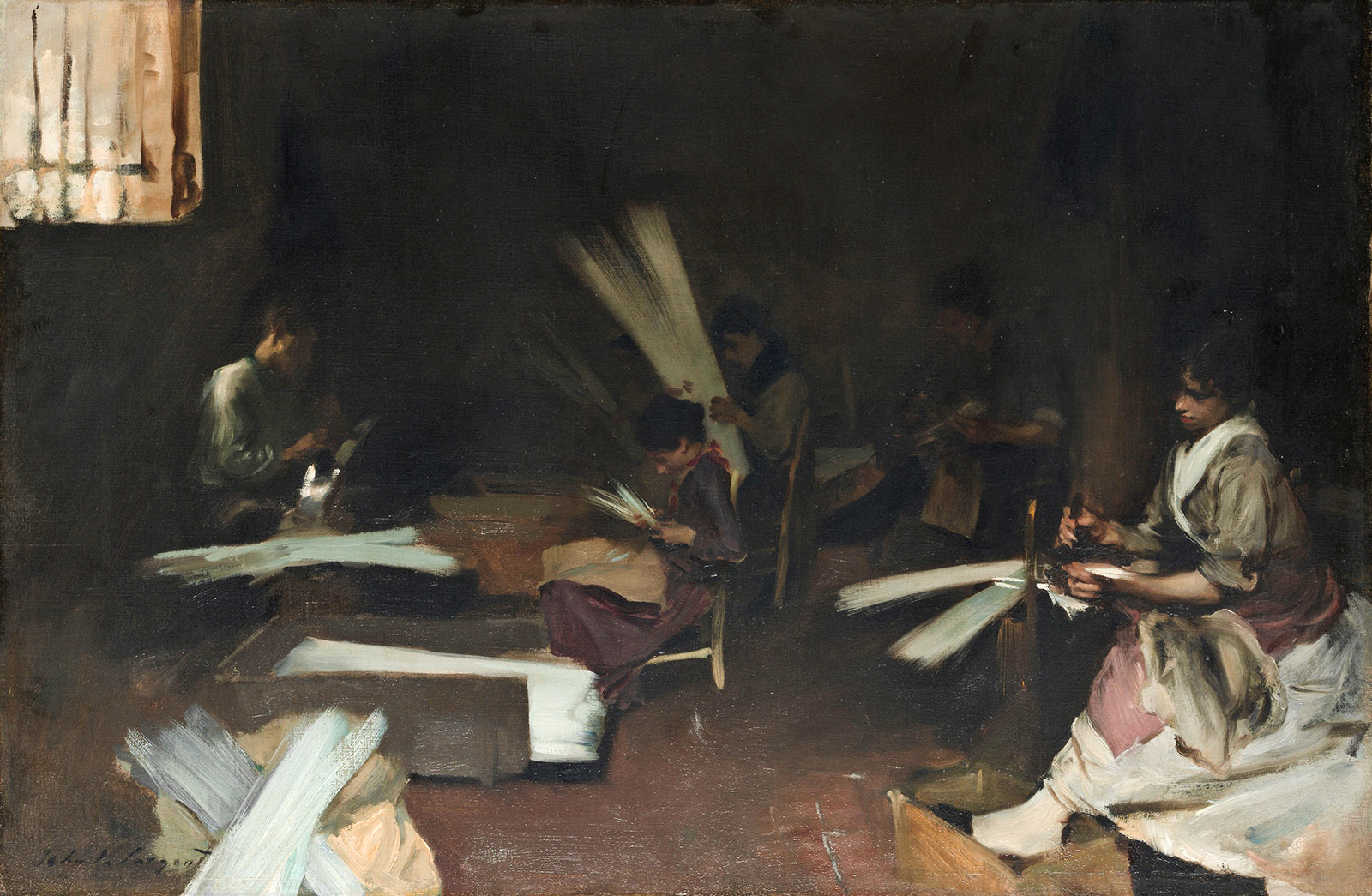
One, in The Sulphur Match, is tilting her chair somewhat precariously while her male companion lights a cheroot. Maybe she has knocked over the flask of wine at her feet. Others are seen in nameless surroundings, ill-lit interiors, or, in many cases, in groups engaged in the ubiquitous homecraft of the time: making glass beads from the bunches of rods that they carry. The attractive exhibition “Sargent, Whistler, and Venetian Glass: American Artists and the Magic of Murano” (which I saw at the Mystic Seaport Museum in Connecticut) brought together not the standard Venetian views, with their sense of distance and scale, but rather views of the side streets and smaller squares, and groups of women of the lower class.2

Venetian Glass Workers; painting by John Singer Sargent

Art Institute of Chicago

John Singer Sargent: Venetian Glass Workers, circa 1880–1882

Whistler was a pioneer of this Venetian picturesque, with its delight in crumbling walls and reflecting surfaces of canals and lagoons, executed in etching and drypoint. He is cited as an admirer of Canaletto the painter, but we are left with the question: What did Whistler know of Canaletto as a graphic artist? Was he able to view the drawings or the rare and very beautiful etchings of Venice, which surely would have appealed to him? There are some three dozen of them and, just as Whistler’s do, they tend to avoid the famous views (the Grand Canal, St. Mark’s, and so forth) in favor of the Venetian mainland—Mestre, Dolo, Marghera—and “imaginary” renderings of cities like Padua. When Whistler first exhibited his Venetian etchings, they were considered in some quarters eccentric to the point of perverse. The painter Walter Sickert said, “It worries me, and spoils my pleasure, to see the Salute on the Giudecca and San Giorgio on the Zattere. Whistler is great, but so is Venice.” But perhaps such liberty of invention is something Whistler picked up from the Venetian tradition.

Sargent addressed the Venetian interiors in his best Spanish style, giving a noble tone to scenes of labor and the poor, much like the tone of his American friends’ lodgings at the Palazzo Grassi, where it connotes the opposite: wealth and leisure and a hint of Las Meninas. He did not build up a comprehensive graphic oeuvre—etchings, woodcuts, lithographs, and the like. He seems to have been content to leave that to the prolific Whistler, who made not far short of five hundred etchings. Sargent, by contrast, created half a dozen lithographs. Yet in that era there was widespread interest, both professional and amateur, in techniques of printmaking. It is almost as if the two artists divided the available work between them: Whistler took etching and pastel and the cognate arts; Sargent took watercolor sketching (in which he was undoubtedly schooled at first by his mother) and oil. The two painters shared the art of portraiture, in which they both excelled, producing works that ignited controversy at the time but that have retained or regained their place in public consciousness. Whistler’s Mother, the butt of so many jokes and parodies, and The White Girlretain their power. Once you become accustomed to Whistler’s habit of labeling his paintings as if they were abstract work, they lose much of their controversiality.

A test comes for the portraitist when his oeuvre is gathered together under one roof, and we see how much of it is dependent on a knack, on a skill that repeats itself. This may be a problem with Whistler, but it is not a problem with Sargent, whose careful, dictatorial vision was clearly on guard against repetition. The stories of his being difficult, of his inviting the sitter to bring a selection of gowns and then rejecting them all in favor of the one she happened to be wearing that day, and of his obsessive repainting are really about not repeating himself. To be instantly recognizable, yes, but not through some trick or mannerism.

At times, with Sargent’s most intense portraits, one almost wishes to turn away, as from Lady Agnew of Lochnaw, who returns the painter’s searching look with an expression that seems to say: I know your reputation, but I have nothing to fear from you. At times too one is astonished, notably at the green beetle-wing dress, with its accompanying purple cloak, that the actress Ellen Terry wore for the role of Lady Macbeth, and for that memorable moment, painted by Sargent, when she tries on Duncan’s crown. That moment is not, of course, in Shakespeare. It is the creation of the designer, Alice Laura Comyns Carr, and part of the astonishment comes from the fact that the dress is embroidered with real iridescent beetle wings, and that dress and cloak have survived in such fine shape. Most of the portraits one might wish to see came to Boston for the exhibition “Fashioned by Sargent,” which went on to Tate Britain in February.

About the portrait of Isabella Stewart Gardner, we are told that when it was first shown in 1888, “many comments alluded specifically to rumors of an alleged affair between Mrs. Gardner and a younger Boston writer.” The hands in the portrait were thought to be suggestively placed. The rumored affair had been with the novelist F. Marion Crawford. Punning on a place in New Hampshire, the jokers said that Sargent had painted Mrs. Gardner “all the way down to Crawford’s Notch.” Gardner was mortified enough by this joke to refuse to display the portrait during her husband’s lifetime.

  • The Bard of the Dimbovitza, Roumanian Folk-Songs, Elena Văcărescu, translated by Carmen Sylva and Alma Strettell, 1891.
  • “Sargent, Whistler, and Venetian Glass: American Artists and the Magic of Murano,” an exhibition at the Smithsonian American Art Museum, Washington, D.C., October 8, 2021–May 8, 2022; the Amon Carter Museum of American Art, Fort Worth, June 26–September 11, 2022; and the Mystic Seaport Museum, October 15, 2022–February 27, 2023. Catalog of the exhibition edited by Crawford Alexander Mann III (Princeton University Press, 2021).